opinion: Tips to Create Better Graphs
As a z/OS consultant, one of the most important things I do is to explain things to my clients. Showing data as graphs or charts is one of the most powerful ways of showing a situation or issue. For example, another article shows how to create a graph showing the 4HRA MSU usage of z/OS systems on a CEC. The graph produced looks like this:
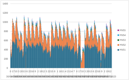
This graph is terrible: by itself it doesn't show or explain anything. So, let's take some steps to bring this graph up to the standard I need when presenting it to a client.
Labels and Values
We can quickly improve this chart by doing three things:
- Label Axes. The X and Y axes aren't labelled. Is the Y axis MSU, CPU seconds or something else? What are the units? What is the X-axis showing?
- Title. The graph has no title. What does it mean: what is it showing?
- X Axis Values. The X Axis labels are squashed together; it's impossible to read them.
The following graph fixes these issues, and is better:
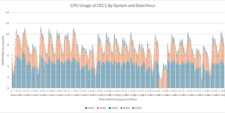
I've moved the legend to the bottom to give more space for the X-axis labels, and reduced the font so the X-axis values can be read. I've added a label to the X-axis, so the user now understands what they are. Dates can be confusing: different countries have different date formats. So, I like to tell the user the date format in the label so it's clearer.
I've also added a label for the Y-axis, including the units (hundreds of MSUs). I could have shown MSUs, but the maximum value is 1400: specifying the units as hundreds of MSUs makes the Y-axis a bit easier to read (and takes up a bit less space).
Presentation
This is a good start, but there's more we can do:
- z/OS System Colours. The colours for each system, aren't very different, so it's difficult to identify each in the graph – particularly the z/OS systems with very small values.
- Spacing. By default, Excel puts spaces between each vertical bar in the graph: this doesn't look very good.
Take a look at the following:
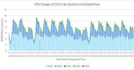
We've changed the colours of each z/OS system: the two with large columns (MVS1 and MVS2) are blue. The other colours are brighter and very different from each other: this makes them easier to see. I change the colours by putting my mouse over the z/OS system in the legend, and right-clicking:
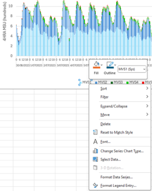
I also reduced the space between each column: I think this makes the graph look better. I do this changing the gap width of the chart to 50%:

More Information
The graph shows the 4HRA MSU data. However, when I create graphs, I usually have something to say, or want to highlight an issue. Rather than making my clients read through the text explaining the graph, I update the graph itself. Here's an example:
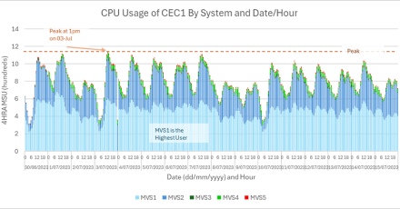
I want to show the client the peak 4HRA MSU, so I've added a line showing it, and when it occurs. I also want to tell the client that MVS1 is the highest CPU user, so I've added a box with this information.
The difference between the first and last graphs are striking. The first graph isn't much use. The last graph is far easier to read and shows information clearly without having to read text to figure out what is going on. Taking an extra couple of minutes to think about the graph and make some small changes has really improved it and will allow my clients to easily understand the points I'm trying to make.
David Stephens
|


